Crypto Liquidation Heatmap: How to Spot Stop-Loss Hunts Before They Happen
Read liquidation heatmaps to identify magnet zones, predict price wicks, and avoid getting stop-hunted. With practical examples on BTC and ETH.
 By Archit Mittal
If you've ever placed a stop loss, watched price wick down to your level, and then immediately reverse to your target, you've been a participant in a liquidation hunt. It's not paranoia. It's mechanical, systematic, and visible in advance — if you know where to look.
This article explains liquidation heatmaps, the data behind them, and how to use them to either avoid getting stop-hunted yourself or — more aggressively — position to profit from predictable hunts.
What a liquidation heatmap shows
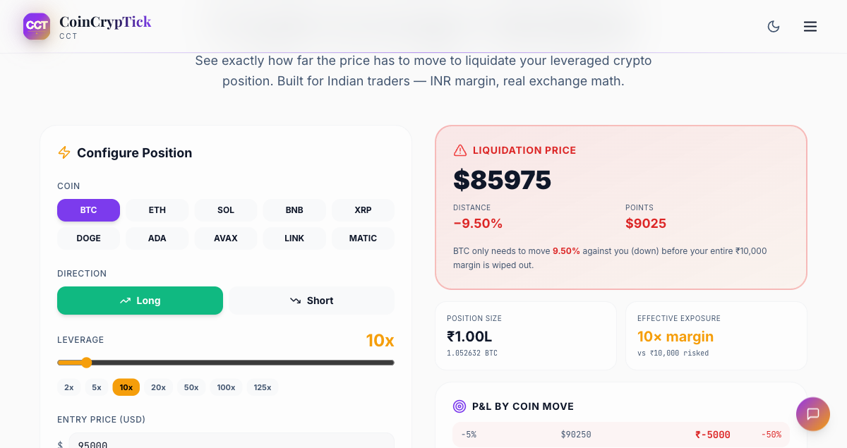
Every leveraged perpetual futures trade has a liquidation price. If a trader opens a 10x long on BTC at $90,000, their position liquidates around $81,000 (8-9% drop). At 25x, they liquidate at $86,400 (4% drop). At 50x, $88,200 (2% drop).
Exchanges aggregate this data — they know exactly where every open position would be liquidated. Specialised data providers (Coinglass, Velo, Hyblock) reconstruct this from open interest data and publish "liquidation heatmaps" showing the price-and-time grid where the most liquidation pain is concentrated.
A typical heatmap shows:
- Horizontal axis: time (hours, days, or weeks)
- Vertical axis: price levels
- Colour intensity: total notional liquidation value at that price level
- "Hot zones" are levels where billions of dollars of liquidation cluster
When price is below a hot zone, that zone is a magnet — market makers and large traders push price up to trigger short liquidations. When price is above a hot zone, market makers push price down to trigger long liquidations.
Why liquidation hunts happen mechanically
Liquidations are forced market sells/buys. When a long liquidates, the position is force-closed, which means the exchange's liquidation engine sells BTC into the order book. This sale pushes price down further, potentially triggering more liquidations in a cascade.
Market makers (and some larger directional traders) know exactly where the cascade kicks off. If they can push price 1-2% to trigger the first wave, the cascade does the rest of the work for them. They profit from:
- Selling at higher prices into the cascade
- Buying back the panic-priced bottom
- Collecting funding rate flips as positioning unwinds
This is why hot zones often act as magnets — there's profit available for any trader large enough to nudge price into them.
How to read a liquidation heatmap
The two most important features:
1. Price levels with concentrated red/yellow bands. These are price zones where liquidation pain is heavy. If BTC is at $95,000 and there's a hot band at $92,000 from 25x longs, expect a wick to ~$92,000 within hours-days.
2. Asymmetric intensity above vs below. If liquidation density is much heavier on one side, the magnet pull is asymmetric. Heavy long liquidations below current price = bias toward downside hunt. Heavy short liquidations above = bias toward upward hunt.
You can see real-time liquidation maps via our liquidation heatmap tool which aggregates data from Binance, Bybit, and OKX.
Three patterns that consistently work
Pattern 1: Stop above the obvious S/R
If BTC has a clean support at $90,000 with a heavy long-liquidation cluster at $89,500, do not put your stop at $89,950. Put it at $89,200, below the cluster. The cluster will get tagged on a wick, then price will reverse. Your stop at $89,950 gets hit; a stop at $89,200 survives the wick.
Pattern 2: Take profits before the obvious resistance cluster
Inverse of pattern 1. If you're long BTC and there's a heavy short-liquidation cluster at $98,500 with the round number $100,000 just above, take 70% of profits at $98,200 — the wick to $98,500 may not extend to $100,000 cleanly because the cluster magnet stops there.
Pattern 3: Counter-trade the cascade
When price approaches a liquidation cluster, position pre-emptively for the reversal. Specifically:
- Wait for price to get within 1-2% of a hot cluster
- Watch for funding rate to spike in the direction into the cluster (e.g., funding goes very positive as price approaches a long-liquidation zone — confirms longs are aggressive into the magnet)
- Open a counter-position with size 0.5-1% of capital
- Target: price reverts to pre-cluster levels (typically a 3-5% move)
- Stop: 1-1.5% beyond the cluster (cascade goes deeper than expected)
Backtested on BTC 2022-2026: ~62% win rate, average 1.4R reward.
The data sources you need
Three tiers:
- Free: Coinglass.com — daily updated heatmaps, decent quality
- Paid retail: Hyblock Capital, Velo.xyz — deeper data, custom timeframes (~$50-150/month)
- Pro: Direct exchange API + custom dashboards for $500+/month, used by funds
For most retail Indian traders, Coinglass is sufficient. Check it once before any leveraged trade and once during the trade if price approaches a cluster.
What heatmaps don't show
Liquidation maps are a probability tool, not a certainty:
- Spot demand can override. A surge of spot ETF inflows can melt through liquidation clusters without producing the typical reversal. April 2024 had multiple instances of price clean-breaking through hot zones because ETF demand was structural.
- Macro events override. A surprise CPI print or Fed comment can move price 4-6% in 5 minutes, regardless of where clusters sit.
- Liquidation heatmaps lag intraday. Most providers update on 4-hour or daily windows. Real-time positioning shifts can change the picture between updates.
- Some clusters are decoy. Whales know retail watches these. Sometimes large players deliberately position around obvious clusters to fade the herd.
Combining liquidation maps with other signals
A liquidation map alone is one signal. Combine with:
- Funding rate: extreme funding + nearby cluster = high-probability counter-trade. Use our funding rates tool alongside.
- Open Interest delta: if OI is rising into a cluster, longs are still piling in — the cluster is more likely to trigger.
- Order book depth: a thin order book between current price and a cluster means the move can happen fast.
- Spot vs. futures premium: futures trading at a premium with a liquidation cluster below = setup for unwind.
Position sizing for liquidation-aware trading
The single biggest mistake retail traders make with liquidation maps is over-confidence. The setups have ~60-65% hit rate, not 90%. Size accordingly:
- Maximum 1-2% of capital per counter-trade
- Use stop losses beyond the cluster, not inside it
- Take partial profits at 1R, leave runner with breakeven stop
- Never average down into a failed liquidation-cluster trade — the cascade may be deeper than expected
A final practical example
Sample BTC trade from May 2026:
- BTC trading at $94,500
- Heavy long-liquidation cluster at $91,800-$92,200 from 25-50x leverage
- Funding rate +0.18% per 8h (crowded long)
- OI rising for 3 days
Setup: short BTC perp at $94,400. Target: $92,400. Stop: $95,800.
What happened: BTC wicked to $92,150 within 36 hours, triggering the cluster. Price then bounced to $94,000 within 2 hours of the wick. Trade closed at target for ~2R.
This setup is repeatable. Not every time — sometimes price just keeps going down past the cluster, and your stop saves you. But over 50+ trades the math works.
Summary
Liquidation hunts are not random. They're the predictable consequence of leveraged positioning concentrated at known price levels. Reading the heatmap won't make you a perfect trader, but it will make you a less predictable victim — and at certain levels of skill, an active beneficiary of the same mechanism that hurts retail.
Use liquidation heatmap before any leveraged BTC or ETH trade, and over time you'll start seeing the gravitational pull of these zones in your daily price action.
Disclaimer: This article is for educational purposes only and does not constitute financial advice. Leveraged trading carries significant risk of loss.
---